
Adobe and CZI Creative Jam
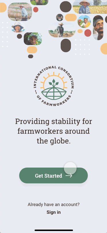
— Adobe Creative JamAdobe Creative Jam, in partnership with the Chan Zuckerberg Foundation, challenged professional designers to design a digital experience that would provide stability and protect the livelihoods of farmworkers. The goal is to create an app for the fictious International Consortium of Farm Workers organization (ICFW) that would make it easy for farmworkers to verify their identity, sign up for services like legal aid, healthcare, housing aid, counseling, food distribution, and get access to timely and credible information.
The Problem
Farmworkers are the invisible frontline labor force of a country’s food supply. Sadly, many of them — the vast majority being immigrants— do not qualify for government stimulus packages during the pandemic. Getting access to safety net services like legal aid, healthcare, housing aid, counseling, and food distribution is very crucial. However, COVID-19 shelter-in-place restrictions have made this increasingly difficult, because gaining access to these services typically requires an in-person meeting to verify identity when signing up. This ultimately leaves farm workers without support when they need it most.
The Challenge
• The app needs to make it easy for farmworkers to verify their identity, sign up for services like legal aid, healthcare, housing aid, counseling, food distribution, and get access to timely and credible information.
• Some farmworkers may not read or speak English, so the user experience should be effortless to understand and design with accessibility in mind.
• Most farmworkers fear giving out information. Not only the verification process needs to be easy, it also needs to look and feel trustworthy.
• Create a community to connect farmworkers and keep them engaged.
• The primary functions should be immediately feasible and implementable.
• We were given roughly 36 hours to ideate, design, create, and deliver a high-fidelity prototype.
![]()
Challenge Accepted!

The Process
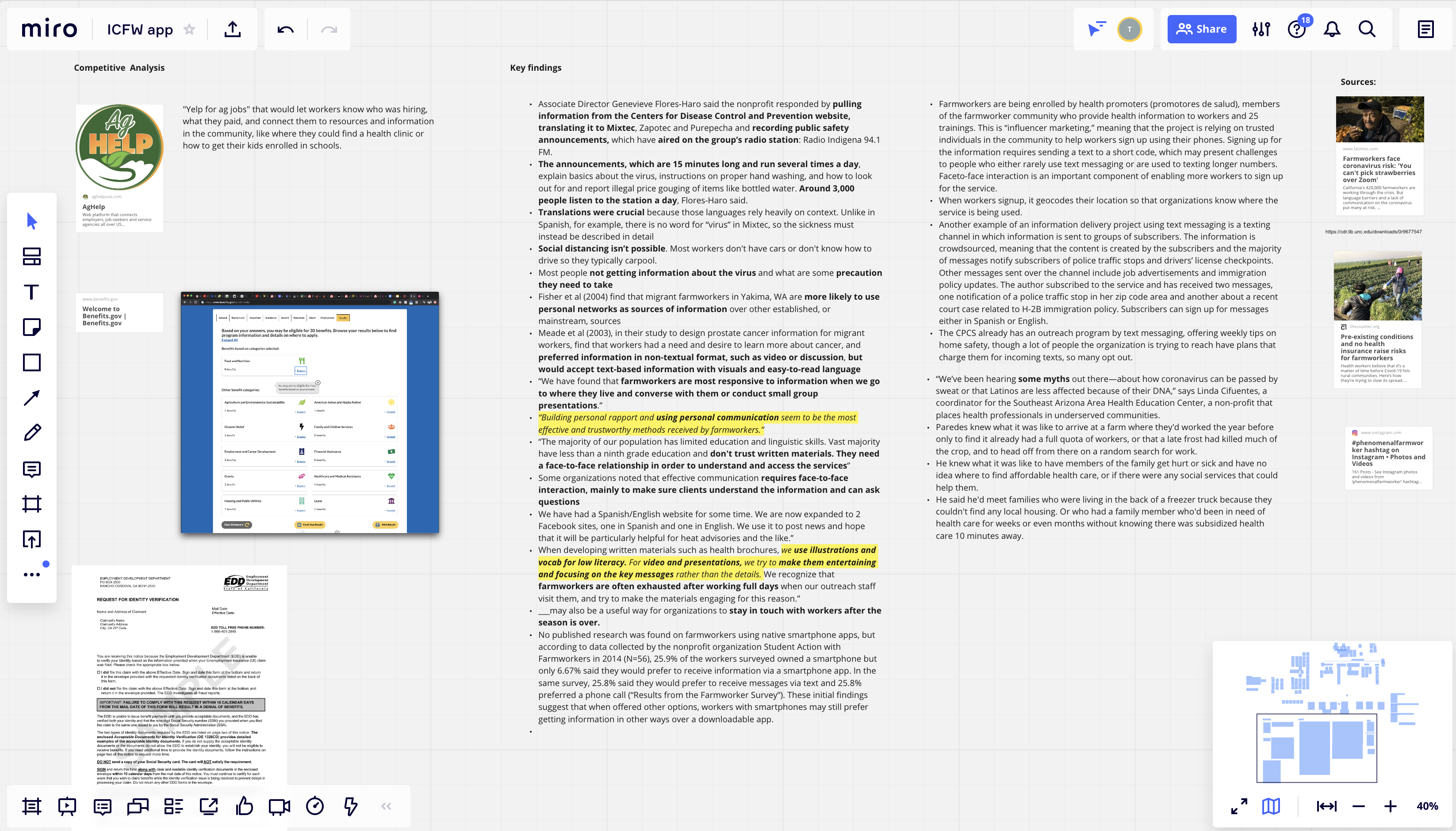
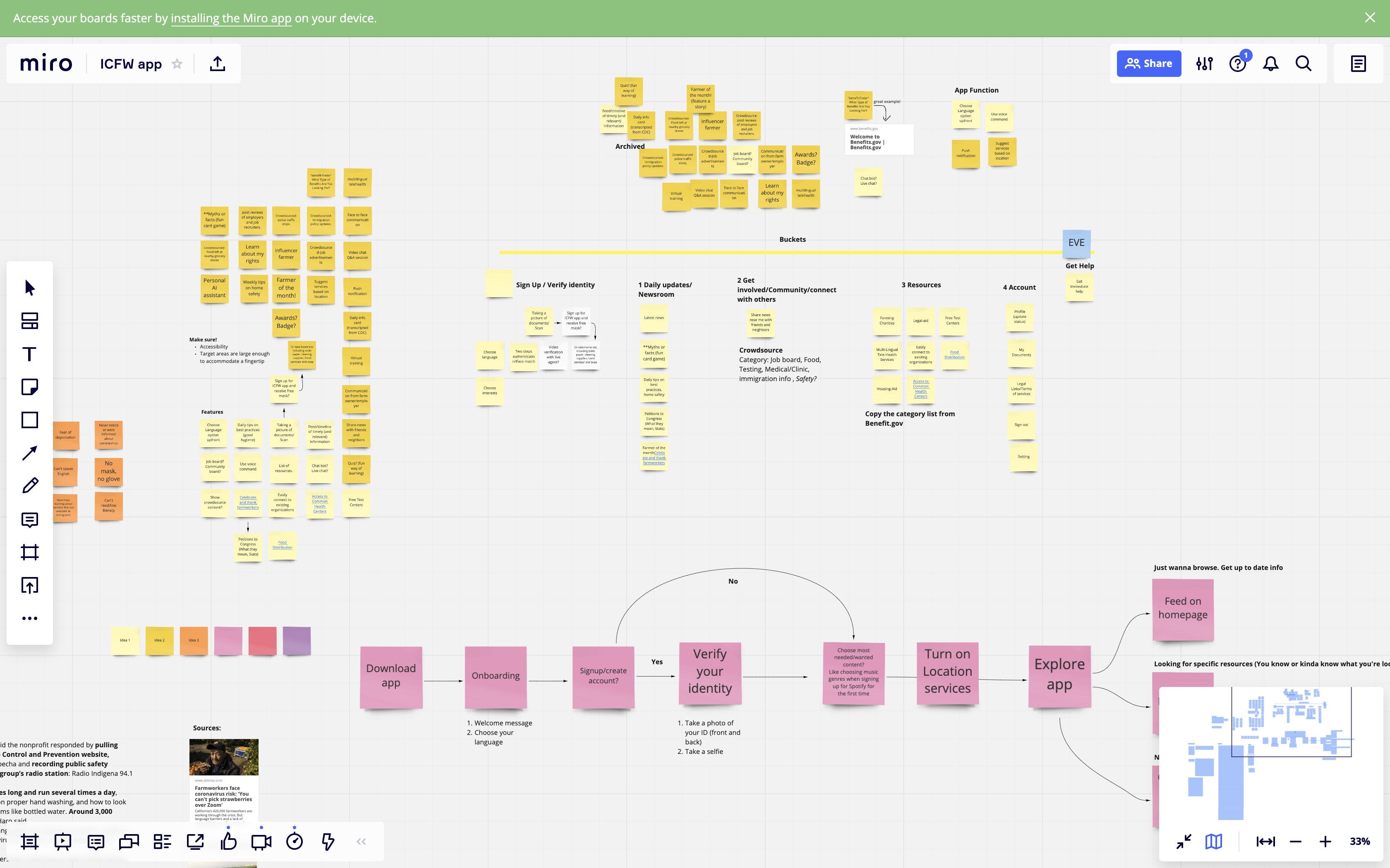
We kicked off the project by doing a quick research on farmworkers in America, identifying their pain points, and conducting competitve analysis. Since Aaron and I were working together remotely, we used Miro to ideate and brainstorm. We then did a card sorting exercise to group the ideas we have for features into buckets. Finally, we split up the task - I started working on the overall flow, navigation, and wireframes while Aaron established the visual design and UI componant.
Key Findings
![]()
Card Sorting
![]()
Wireframes
![]()
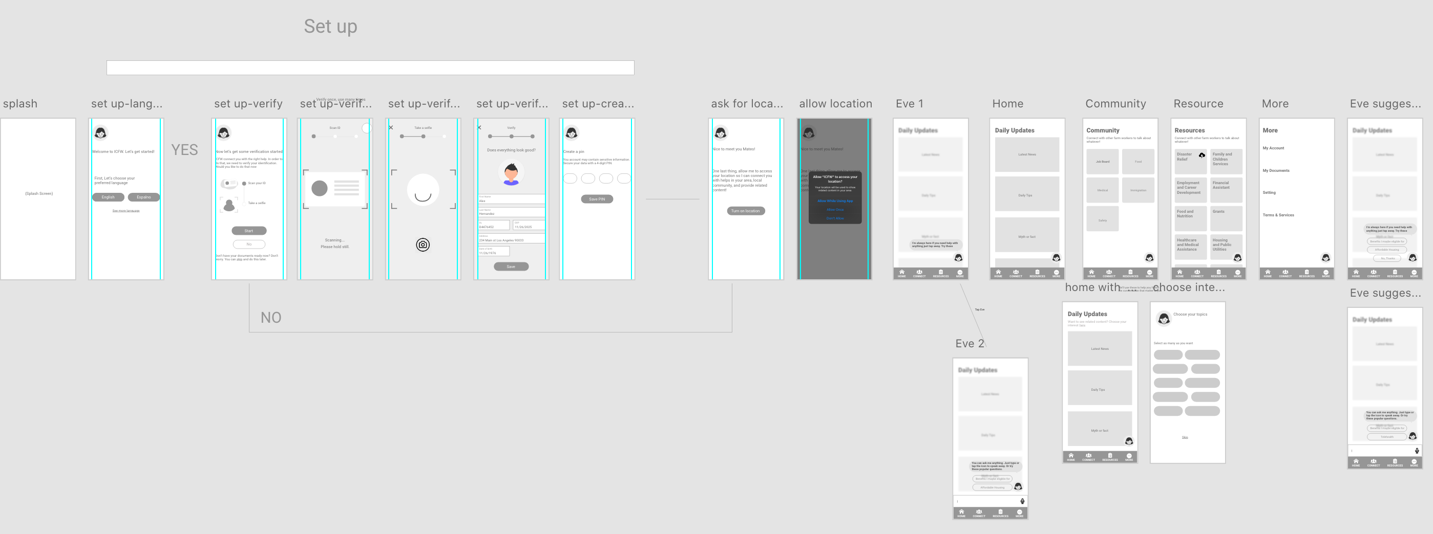
![]()
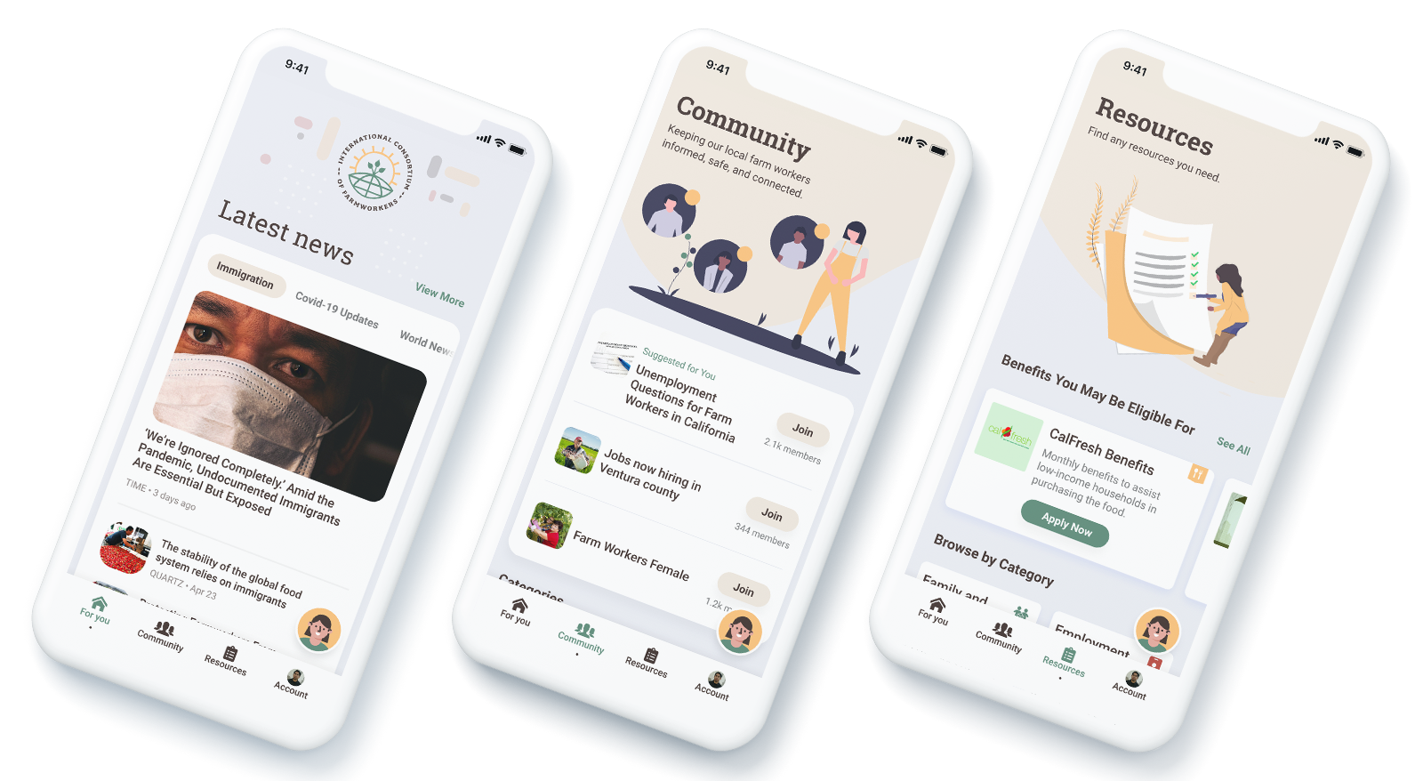
Let’s Take a Look at the Key Features
With what we learned from our quick research, we came up with the key features that would make our app stands out and, most importantly, be useful for farmworkers.
︎ Creating an accesible and inclusive experience for our farmworkers
To cater toward low literacy and multilingual audiences, we provide the ability to choose preferred language up front. We include the most common spoken languages among farmworkers in the US in the initial load but also provide a way to choose other languages in just one click. This way, we don’t overload the user with too many options at once. We also make sure that the app relies heavily on visual (illustrations, icons, color) and easy-to-read language so that farmworkers understand and able to access the services they need in a timely manner.
︎ Giving a friendly voice that guides farmworkers throughout the whole experience
Right when farmworkers open the app, they will be greeted by Eve, a helpful chatbot, who can help them get started and set-up. From our research, we found that face-to-face interaction and personal communication tend to be the most effective and trustworthy methods received by farmworkers. Having Eve guides them through the process and available anytime they need help would feel like getting help from an actual person. If they can’t find what they are looking for, they can just tap Eve and type in a keyword. Eve will provide a few suggestions as well as offer to connect them with a representative if they need further assistance.
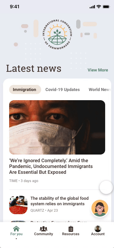
︎ Personalized & Easily Digestible Content
With the amount of information and resources out there, farmworkers can easily feel overwhelmed and lose interest in finding the right info and resources they actually need. Not only we present the news and contents that are most relevant to them (based on their location) up top, we also provide an option to select their interests so their feed can be customized to fit their need even more.
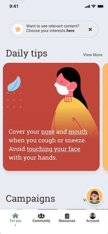
Farmworkers are often exhausted after working full days. They want to focus on key messages rather than details. So we include “Daily Tips” section as a way for farmworkers to learn about health related information using fun visual design and short, easy-to-read copy.
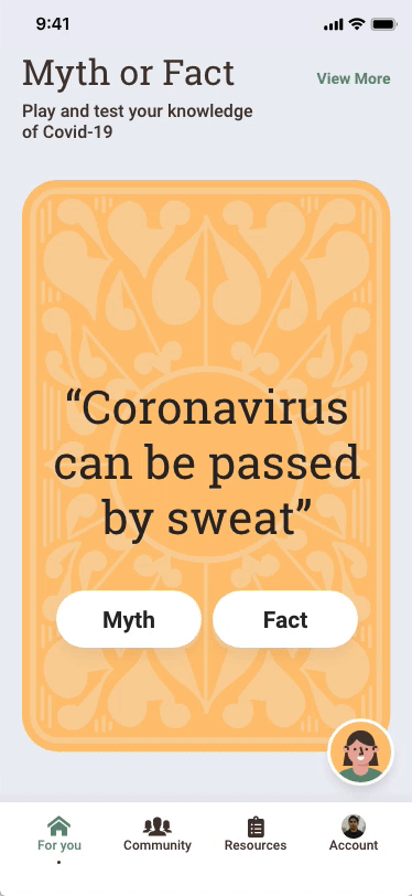
Another area that made our app stands out is the “Myth or Fact” feature which is an interactive game to learn and test their knowledge about COVID-19. We got this idea after reading about how there are some myths out there that being told among farmworkers that “coronavirus can be passed by sweat or that Latinos are less affected because of their DNA”. We thought turning learning into a game would keep farmworkers engaged and encourage them to keep coming back to the app!

︎ Keeping farmworkers informed, safe, and connected through trusting community
During our research, we found that many farmworkers are more likely to use personal networks as sources of information over other established, or mainstream, sources. So we include Community as one of the main features, dedicates to a topic or experience that is driven by the farmworkers who share similar interests and experiences. Farmworkers and find/share things like unemployment insights from fellow farmworkers, job available in their areas, food distribution updates, pro-bono attorney services, etc.
︎ Finding the right Resources
Finding resources can be overwhelming. Our Resource page serves up benefits that are most relevant to farmworkers and that they may be eligible for. We also group all the resources together into easy-to-digest categories. In each of the resource detail page, there is a section that allows farmworkers to check their eligibility instantly by answering a few simple questions. This way, farmworkers may be able to save times instead of having to do any further reading, calling someone to ask, or physically going to an office.
︎ Verify and store neccessary documents
One of the main goals of the app is to make it easy for farmworkers to verify their identity since typically that is required to gain access to safety net services. The verified documents are stored and easily accessible under “My Documents” page. There is also a section that contains recommended documents (based on their info, interests, and location) that are usually required to sign up for services - so that they have everything ready and help speed up the application process.
![]()
72 Hours Later...

The Outcome
The amount of time we had for this project and the constraints was a great challenge and learning moment. Conducting researches, brainstorming ideas, rapid wireframing and prototyping - not to mention we had to learn to use Adobe XD for the first time - all done in 3 days (yes, we did have 2 hours of sleep on the final night :D) I feel like I learned so much and sharperned many skills that I would not normally have had the opportunity to do in an everyday work setting.
🎉 Our app also won 3rd place against 300 professional designers, 90 projects submitted, across US, Canada, and UK!


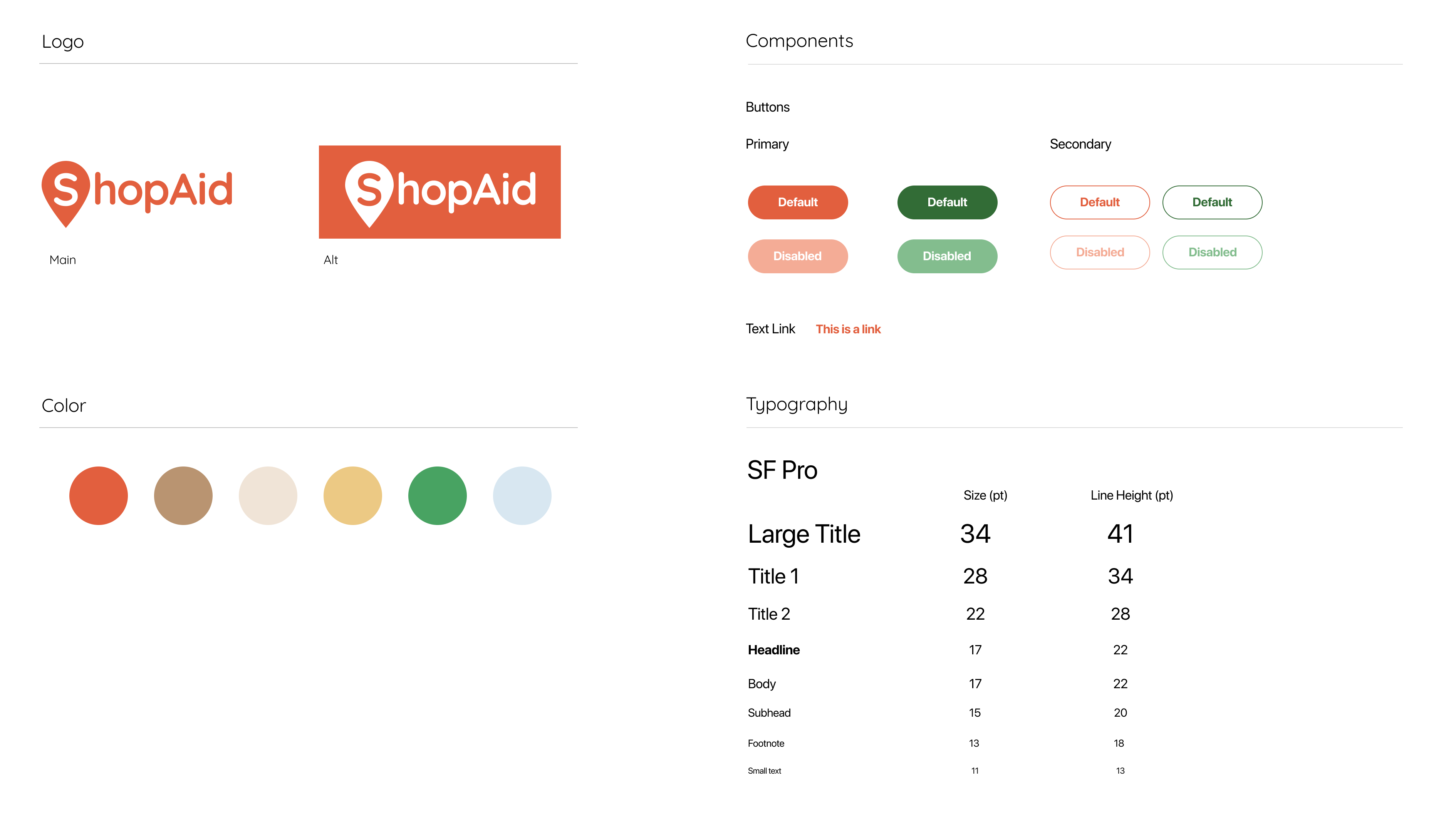
ShopAid
— AppMy Roles:
Product Designer // Visual Designer
Tools:
Figma // Ai
Team:
Monique Ho, Sally Huang, Vikram Singh, Jamil Shah Foridi, Serena Patel, and Kaleb McKinney
Project Year:
2020
Product Designer // Visual Designer
Tools:
Figma // Ai
Team:
Monique Ho, Sally Huang, Vikram Singh, Jamil Shah Foridi, Serena Patel, and Kaleb McKinney
Project Year:
2020
ShopAid aims to generate a safe game plan for your trip to local stores, helps reduce panic buying, and encourages social distancing. The original idea came out of a 48-hour virtual hackathon that brought together many talented people from all over the world with one goal in mind - to help improve the lives of those affected by the COVID-19 crisis.
The Problem
During the pandemic, we have all experienced panic buying, inventory shortages, and long lines at grocery stores at some point. There is no real-time stock availability or price information from stores today. Shoppers don't know where they can get what they need, or how much of it is available, or what it costs without going to the store. How can we make the local shopping experience easier, faster, and more efficient for shoppers?
The Challenge
• We wanted to tackle this problem with a different approach by focusing on the items instead of the stores. That means, for example, if the user have five items they need to buy on their list and the items are all spreaded out in several different stores/locations, then how might we make it easy for the user to purchase all the items in a timely manner?
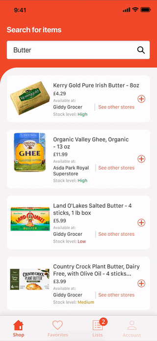
• Most stores wouldn’t share stock availability information with us, so we had to figure out other ways to obtain the information so that we can display real-time stock level to the user.
• We also asked ourselves, how might we make this more than just an app to view stock level information? How might we make this experience more fun, engaging, and tailored to each user’s specific needs.
• This was my first hackathon experience which happened to be a global hackathon that brought together many talented people from all over the world (a total of 822 participants across 62 countries)! Everyone on our team came from different background and were all living in different time zones. Having to do the intitial phase of this project in 48 hours was definitely a great challenge in itself.
Let’s Get Started
The Process
Within the first 24 hours, our team sent out surveys, conducted competitive analysis, gathered data & info around local shopping behaviors during the pandemic, and identified key pain points so we can focus on MVP features, On the design side, we started to map out user flows, constructed information architecture, and sketched out wireframes. At this point, I started to explore interface and visual design using variety of tools (pen & paper, Illustrator, Figma, etc,) in order to rapidly iterate on a wide variety of ideas.
High Level User Flow
Style Guide & UI components
Now, The X Factor
Key Features
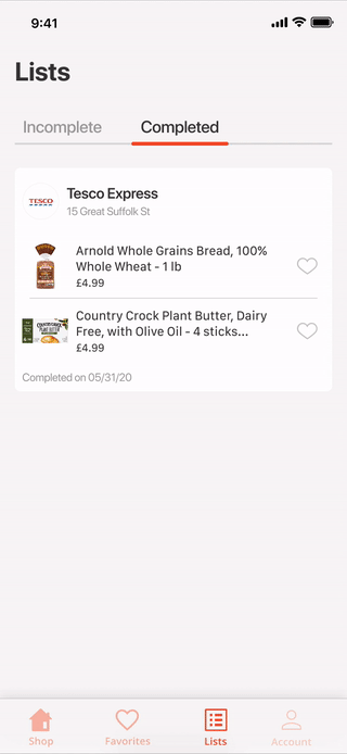
︎ Check item availability and stock level from the comfort of your home or anywhere you are.
︎ Make the most out of your trip! Find stores that carry the majority items in your shopping list, or choose from your favorite stores.
︎ See stores peak hours to avoid crowd.
︎ Save your shopping lists to save time and shop smarter.
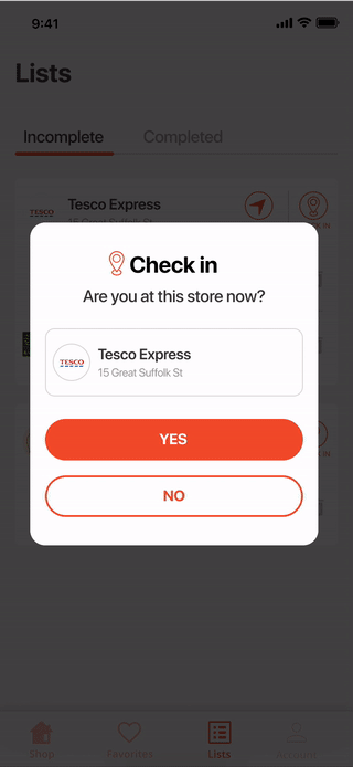
︎ Contribute to the community and help other shoppers by quickly marking stock level information.
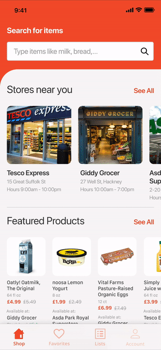
The Search Bar is always at the top for easy access. When the user taps on the search bar, they also see a list of popular searched items.
︎Travel Guidance to Store Location(s)
Based on the items that are selected, the app smartly display the items grouped by store location, with the least amount of travel time at the top.
Based on the items that are selected, the app smartly display the items grouped by store location, with the least amount of travel time at the top.
︎Crowdsourcing Stock Level
Crowdsourcing data from shoppers in real time helps ShopAid app users avoid showing up to stores to find out that their item is out of stock and make smarter trip planning.
Crowdsourcing data from shoppers in real time helps ShopAid app users avoid showing up to stores to find out that their item is out of stock and make smarter trip planning.
︎Favorite Items for Easy Future Purchase
Users can favorite frequently purchased items so that they can easily stock availability in different stores based on their location and preferences.
Users can favorite frequently purchased items so that they can easily stock availability in different stores based on their location and preferences.
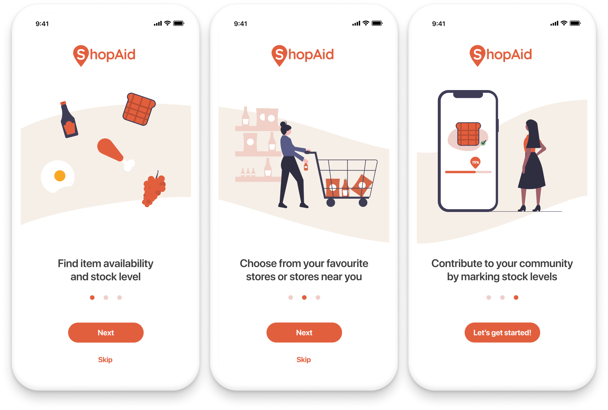
First Time User Experiences
Onboarding screens
![]()
Setup flows
![]()

Wrapping Up...For Now
The Outcome
ShopAid was well received by the judges and other participants. Though we did not win first place, we were a Runner-up!
︎ Check out the article they wrote about our project here.
Next steps we are working on ways to get data from local stores for our initial launch. Along with that, we are looking to add more features like turning recipes into a list of items to buy, budget management, using AR camera to quickly report stock level, etc.

DailyUI
To keep my creativity flowing, expanding my knowledge, and improving my UI design skills, I decided to join Daily UI challenge where everyday, I design different User Interface elements for web and mobile. I will continue to update this page as I go through the challenges for each day.
Design tools: Sketch, Principle
Day 01 - Sign Up
"Design a sign up page, modal, form, app screen, etc. (It's up to you!)"
My solution: I imagined a signup page for an app that users would use everyday for daily inspirations. Upon downloading the app, users have options to sign up with Facebook or email. I also added an option for when a user might not want to get an account just yet, but still want to give the app a try. I find that really makes experience more pleasant when you‘re not forced to give up your information when you’re unsure about it.

Day 02 - Credit Card Forms
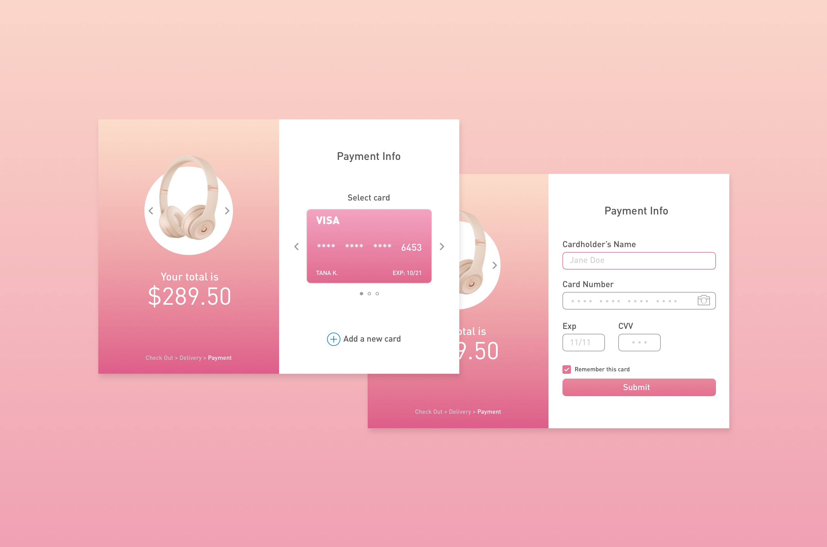
"Design a credit card checkout form or page. Don't forget the important elements such as numbers, dates etc.“My solution: Checkout process is one of the most important part of almost every business. Having a simple UI and great UX is the key to make user experience seamless and effective. I designed the interface to display the product(s) and total price on the left so that users can review what they are buying at any time. On the right section, credit card(s) is shown and users also have an options to choose a different card or add a new one.
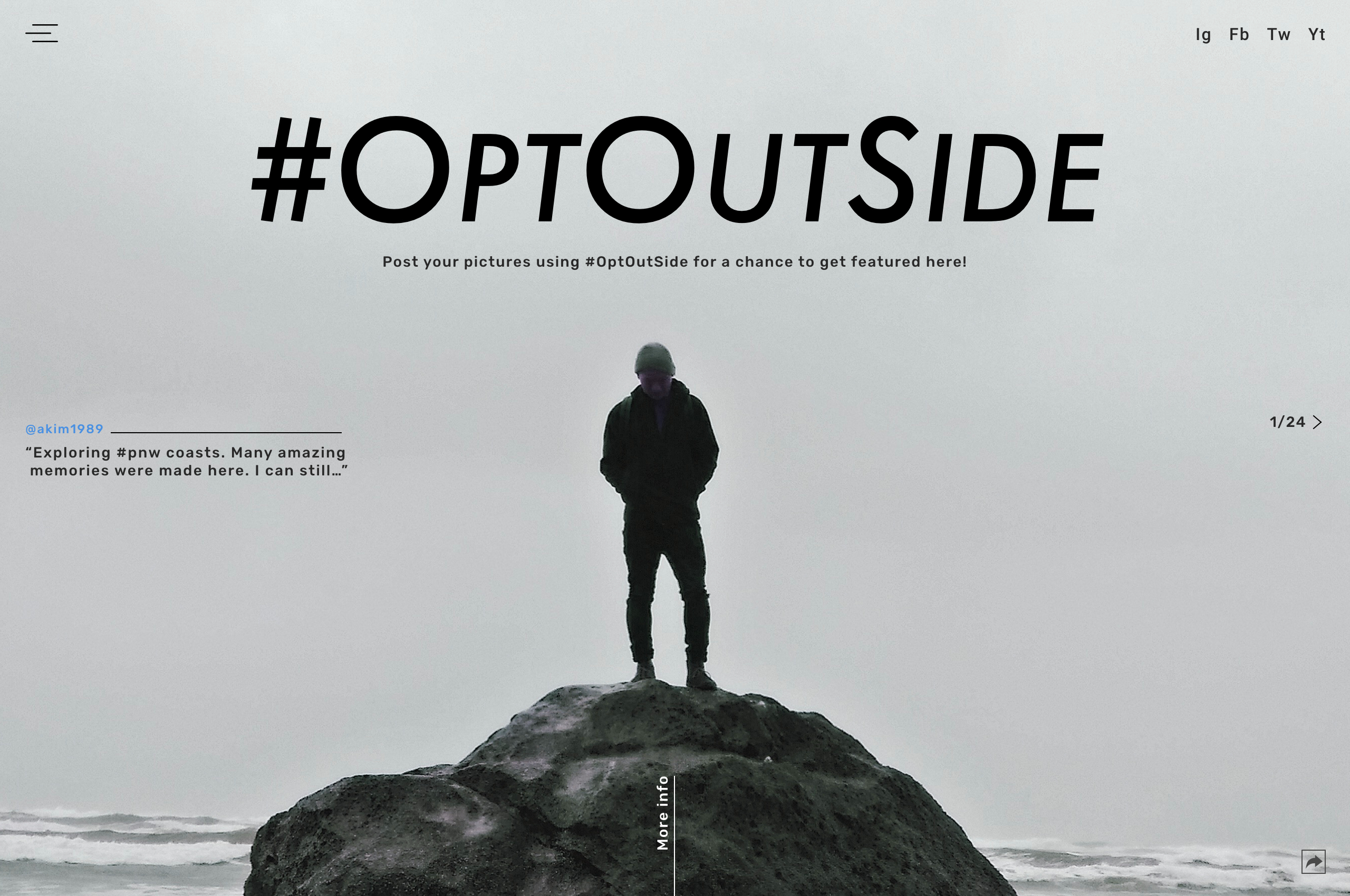
Day 03 - Landing Page
"What's the main focus? Is it for a book, an album, a mobile app, a product? Consider important landing page elements.”My solution:
REI has a social campaign encourage people to just simply go and enjoy yourself outside. Many people around the world participate by posting their pictures on social media with #OptOutSide. I thought it would make the experience even better to have a landing page as a main hub to showcase selected photos from this campaign. The images are shown full screen in the background to create strong visual impact and to capture user’s attention.
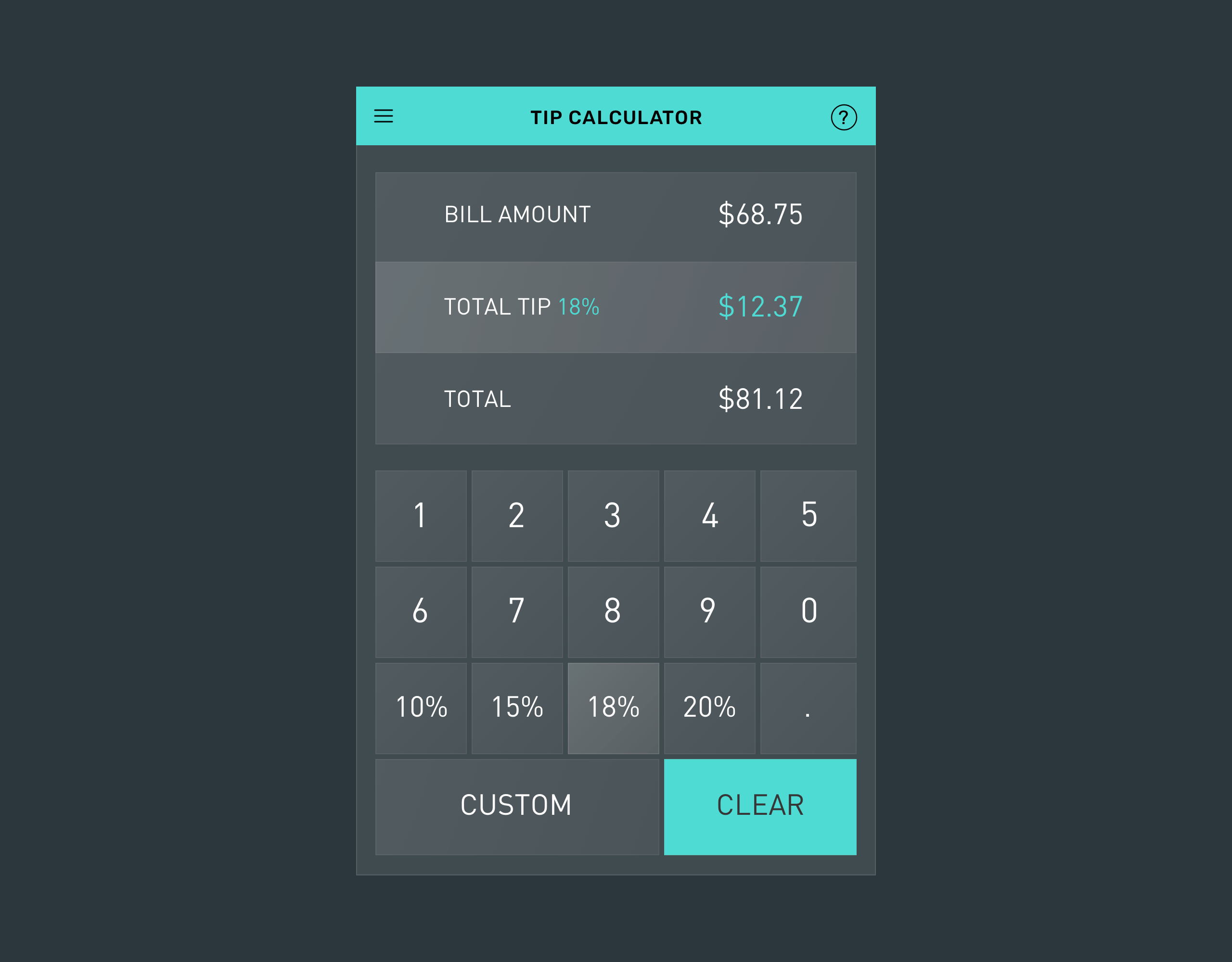
Day 04 - Calculator
"Design a calculator. Standard, scientific, or specialty calculator for something such as a mortgage? Is it for a phone, a tablet, a web app?”My solution: What’s more useful than calculator? A tip calculator! This’s an interface for a tip calculator app for users to quickly figure out how much they should tip at a restaurant. It includes the most common(and suggested) tip percentage options (in America.)
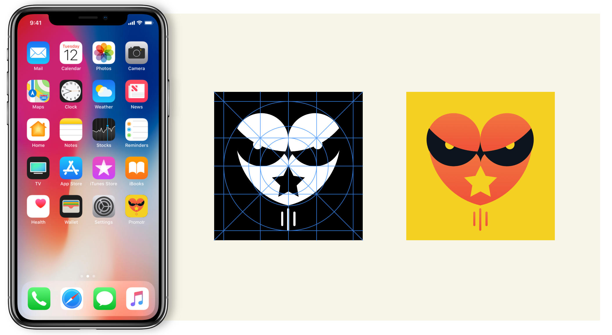
Day 05 - App Icon
"Design an app icon. What best represents the brand or product? Or is it incredibly unique? Does it look great at a distance and does it stand out when put on your home screen alongside other apps?"My solution: I designed this icon for a mail/delivery tracking app. The icon represents an owl. I got my inspiration from, yes, Harry Potter! For those of you who don’t know, in HP, owls carry message and items from one person to another. I chose orange on yellow so that the icon would stand out from others when viewed on a phone. Also, these color are associated with happiness and optimism.
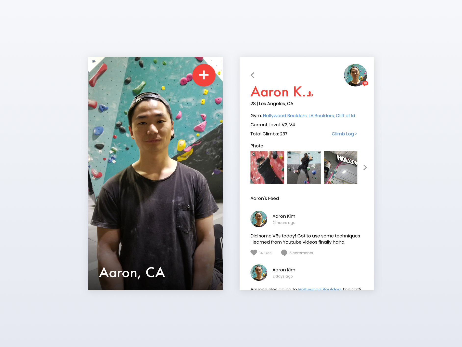
Day 06 - User Profile
"Design a user profile and be mindful of the most important data, names, imagery, placement, etc. Is it for a serious profile? A social profile?”My solution:
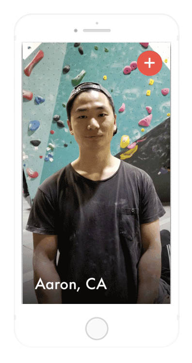
This’s a user profile page for a rock climbing app. I notice that there are not a lot of app in the market that dedicated for people who do indoor rock climbing. So I had this idea of Facebook for indoor rock climbers. Users create accounts and share anything rock climbing related. Connect with other climbers by browsing profiles sorted by location, level, and more! Beside social aspects of the app, users can also log their climbs and track climbing progress.
Day 07 - Settings
"Design settings for something. Is it for security or privacy settings? Game settings? What is it and what's important?”My solution: This’s a light setting page for a smart home app where you can control lights in your home. You can change color, adjust brightness, set a timer, and turn off/on - all from your phone!

Day 08 - 404 Page
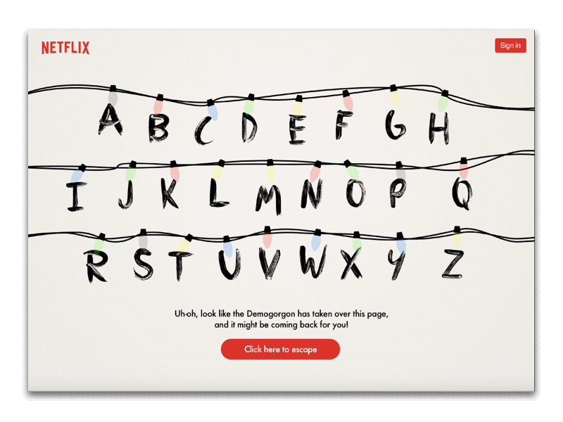
"Design a 404 page. Does it suit the brand's style? Is it user-friendly?"My solution: If there’s a site for Stranger Things, this’s what the 404 page should look like :) Taking inspiration from the show itself, the error page depicts the famous alphabet wall scene with a warning message from Will.
Day 09 - Music Player
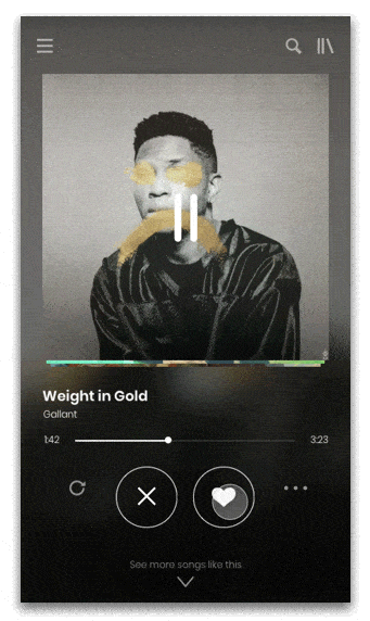
Spotify x Tinder
My solution: In today’s fast paced society, not everyone has time to browse through an endless list of playlists to find what they are looking for. Many music apps now offer "Top Recommendations For You “ but the problem is you still have to click one by one through them to check out the songs. So I had an idea of using Tinder functionality as a way to quickly browse through the list. You can swipe left (or tap ‘x’) if you don’t like the music or you can swipe right(or tap the heart icon) if you like it and it will automatically be saved to your playlist. This’s a fun alternative way to browse for favorite music that targets millennials who have short attention span.

Day 10 - Social Share
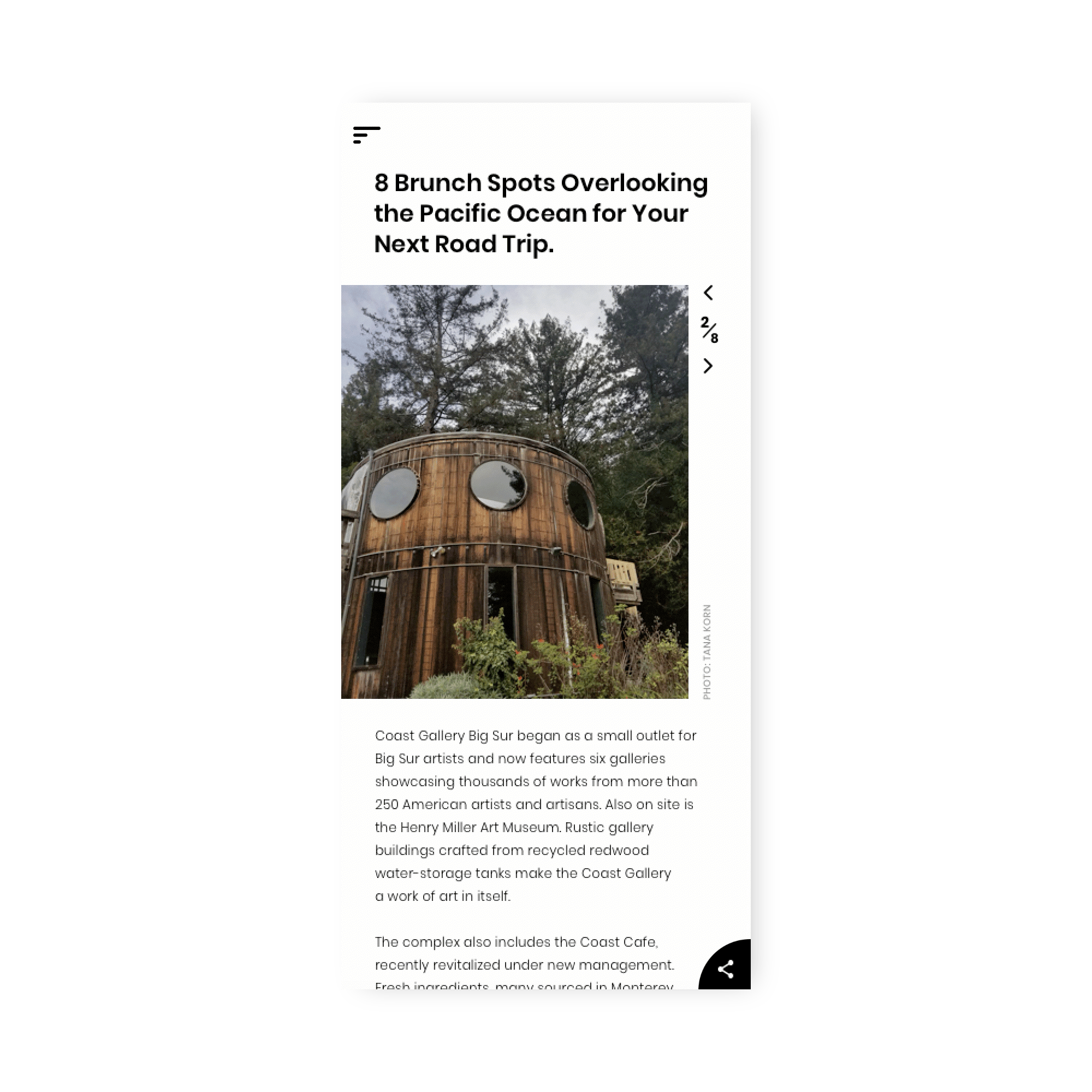
"Design a social share button/icon and be mindful of the size, imagery, placement, and purpose for sharing.”My solution: I designed a social media sharing for a travel blog. When reading an article, users can share it to their social media by tapping the share icon. The icon is fixed to the bottom corner so users can share at anytime no matter where they are on the page.
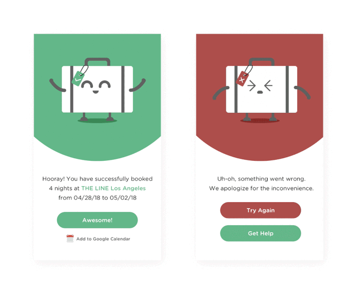
Day 11 - Flash Message (Error/Success)
"Design a Flash Message with both the outcome for an error and success. Is it for a sign up form? A download/upload message?"My solution: This’s a flash message for hotel booking site. If the booking is completed successfully, you will be served with a congratulation message as well as a short summary of your booking. On the other hand, if it didn’t go through, the error message will appear with options for you to either go back and try again or get help from customer service. I added cute little animation to make the process more fun and user-friendly.
Day 12 - E-Commerce Shop (Single Item)
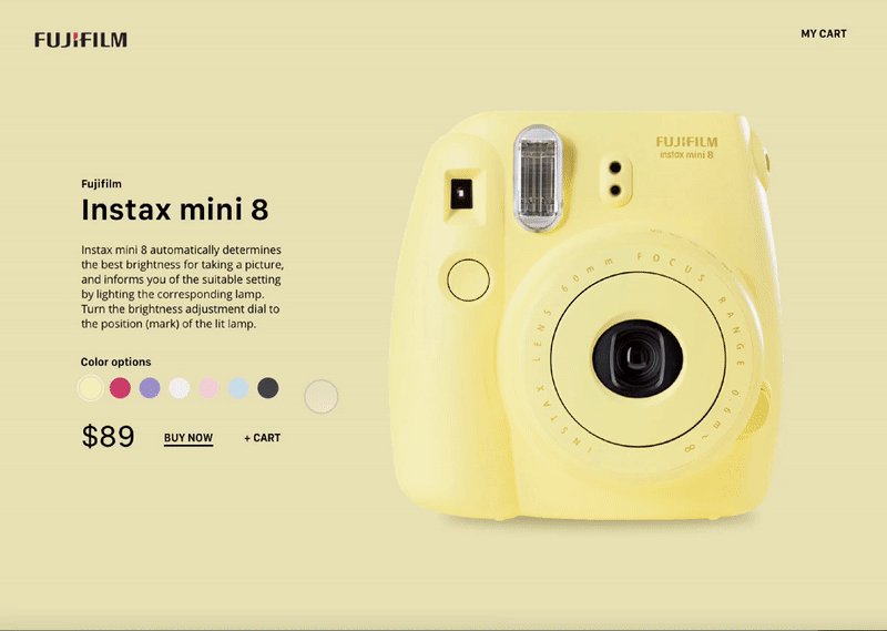
"Design an e-commerce shop. Is it simple for a local business or a large online retailer? Is it for clothing, shoes, handmade soap, or something else?”My solution: This’s an e-commerce shop for polaroid instant mini. Since there are seven color options for this edition, I thought it’d be fun to add a little interaction where the color of the background and the camera seamlessly change as you click through the options.
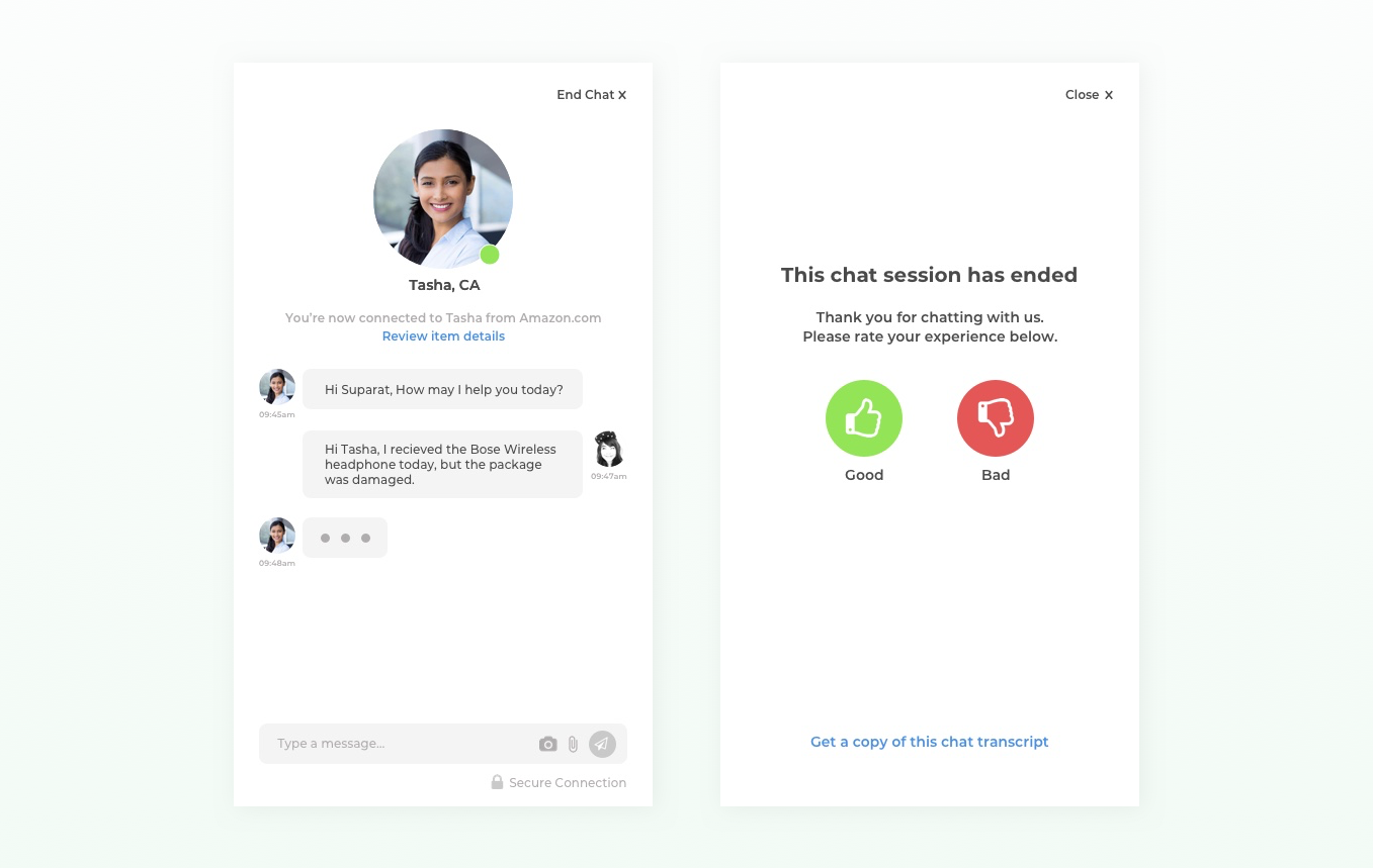
Day 13 - Direct Messaging
"Design a Direct Messaging app, profile, or chatbox. Consider the parties involved in the messages, images, placement, and context of the messages. Are the messages for social purposes? Customer support?”
My solution: I love it when a business offers customer online chat support. It’s convenient, fast, and reliable. I designed this interface having that principle in mind. To ensure that a user is talking to a real person, I added representative’s name and photo at the top to make user feel more personal. The little green circle indicates that the representative is currently online (in case there’s a connectivity issue). At the bottom, there’s a camera and attachment icon in case there's a need to send over any visual reference. At the end of the chat, user will be prompted with a screen asking to rate the experience. This’s a fast and simple way to get user’s opinion in stead of asking them to fill out a form. There’s also an option to obtain a copy of the chat transcript as a peace of mind for future reference.
Day 14 - Onboarding
"Hint: Design something onboarding related. Are you recruiting people for an organization? To sign up for a new website? A mobile app?"My solution: I found that even though I regularly use Dribbble as a source of inspiration, it took me some time to understand the whole process on how to contribute to this community. So I created a simple and easy to follow guide of how one can become a Dribbbler. See it in action︎
